Design Alternatives
Navigating the Design Space: Choosing the Campus Canvas
We evaluated three distinct map paradigms to serve as the foundation for the Campass experience, balancing geographic utility against narrative immersion.
Campus Canvas Alternatives
Select an option below to view the radar chart and details. Option C was selected as our final choice.
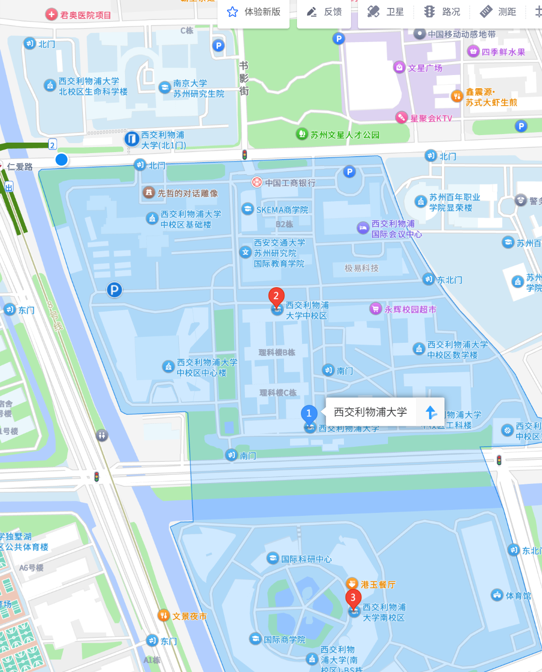
Option A: The Utility Paradigm
Standard Mobile Map using third-party SDKs like Google Maps or Gaode Maps.
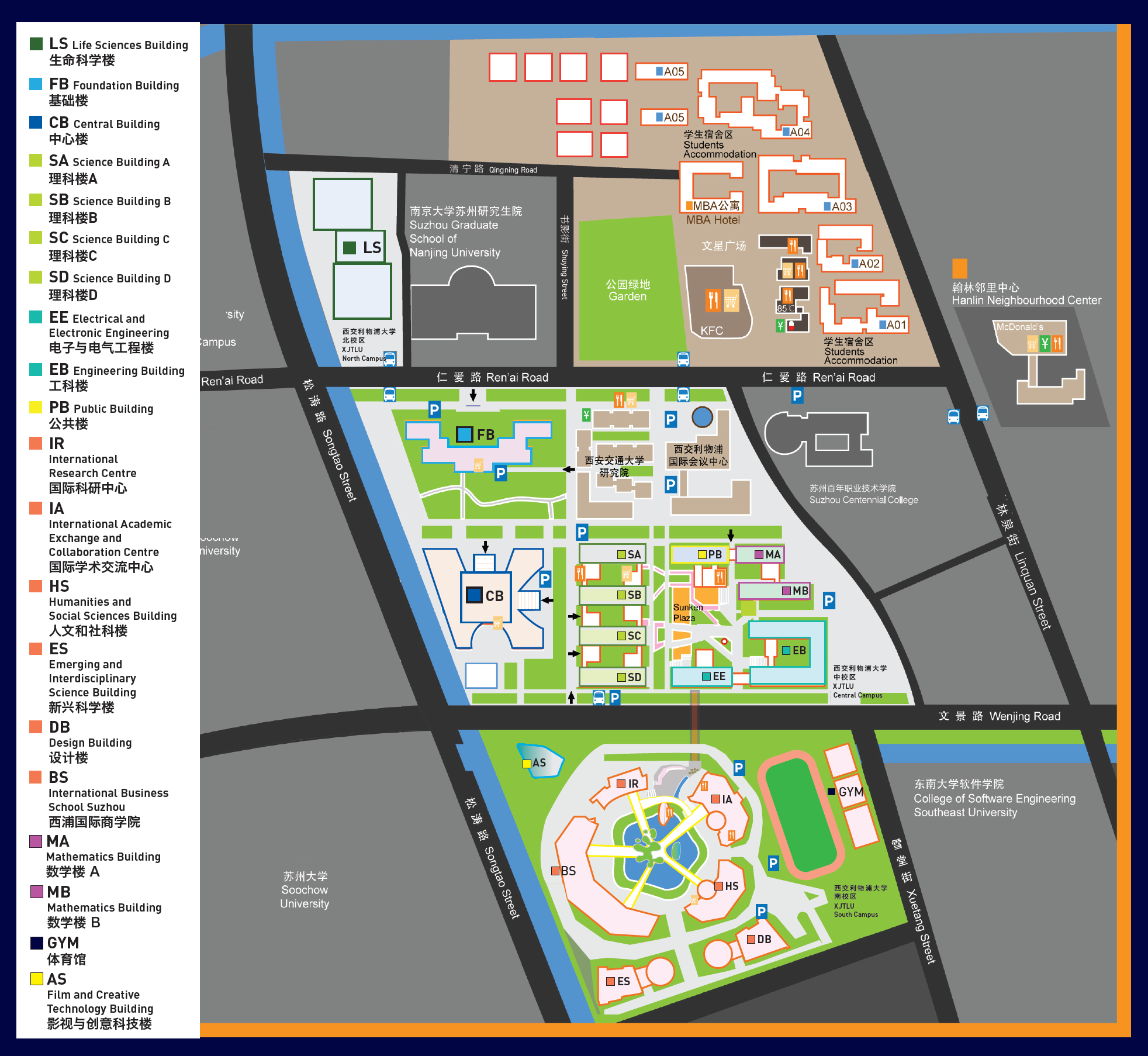
Option B: The Information Overload
Adopting the highly detailed, multi-colored official campus map used for administrative logistics.
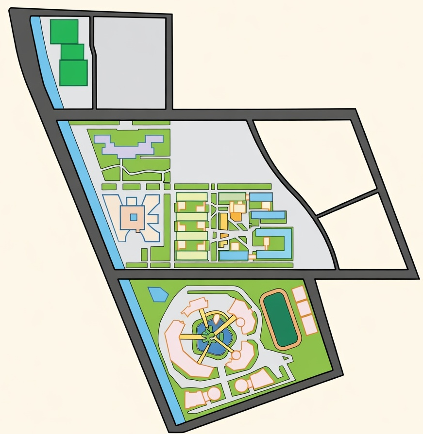
Option C: The Narrative Stage
A custom-drawn, brand-aligned vector map that strips away all non-essential geometry to focus on the exploration path.
Option A: The Utility Paradigm
The Dilemma: While offering pinpoint accuracy, these maps are cluttered with commercial POIs (restaurants, parking lots) and "commuter" visual language that breaks the game’s "Magic Circle."
Metrics Definition
- Geographic Accuracy: The degree of alignment with real-world satellite coordinates.
- Narrative Immersion: The ability to maintain the "Magic Circle" and gamified atmosphere.
- Development Efficiency: The speed of implementation using out-of-the-box tools vs. custom code.
- Signal-to-Noise Ratio (SNR): The clarity of interactive quest elements against the background environment.
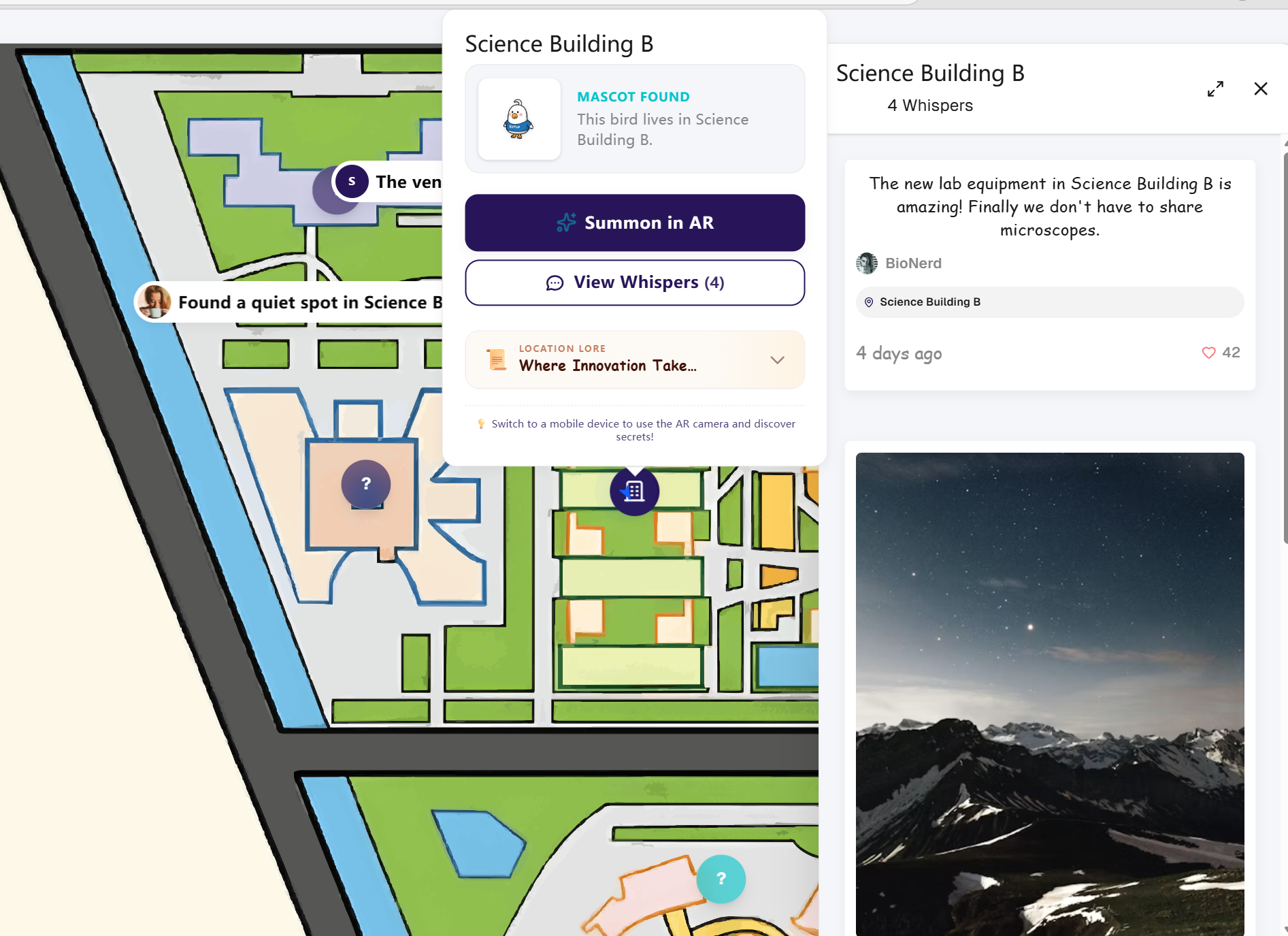
The Desktop Dilemma: Map Pin Interactions
While our mobile interface successfully utilized a comfortable bottom sheet, designing the desktop interaction for map pins presented a unique challenge. On wide screens, we wanted to display rich location details (AR triggers, clues, achievements) alongside the global Message Wall. However, translating point-of-interest (POI) interactions to a larger canvas quickly led to cluttered interfaces and broken visual flows.
Map Pin Interaction on Desktop
Evaluating how to display point-of-interest details on wide screens. Select an option below to view its pros, cons, and dilemma.
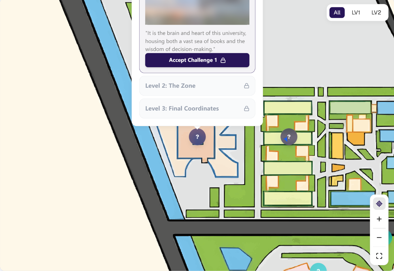
Option A: The Standard Popover (Only)
A centralized floating card appearing directly over the map.
Option B: The Fragmented UI (Popover + Side Drawer)
Keeping the center popover for location details, while simultaneously opening a right-side drawer for the Message Wall.
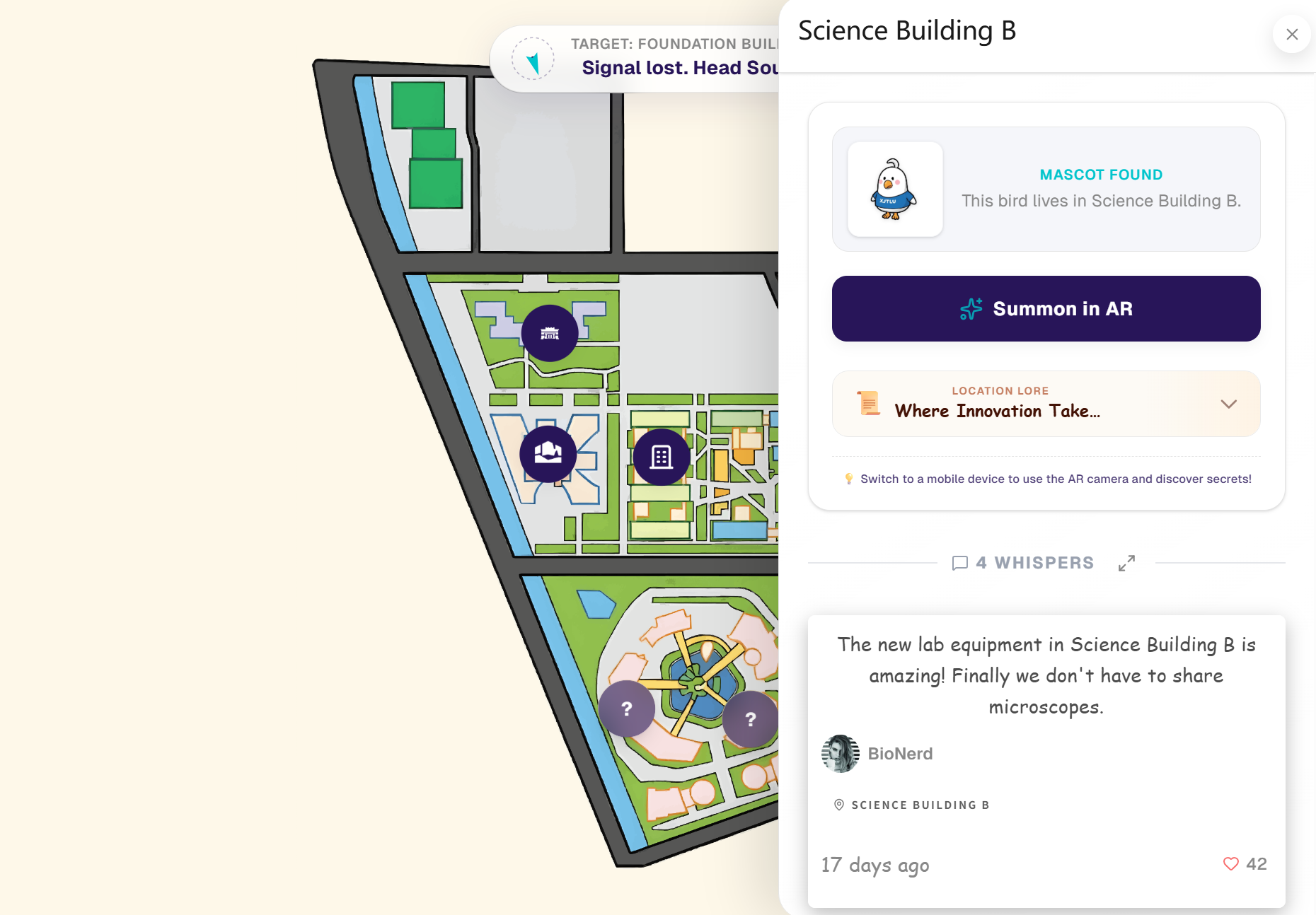
Option C (Our Decision): Architecture Forking & Master-Detail View
Discarding the popover entirely for desktop environments. Clicking a pin now triggers a unified, full-height right sidebar.
Option A: The Standard Popover (Only)
The Dilemma: It drastically underutilized desktop screen real estate. Furthermore, to keep the user focused, clicking a pin automatically centered it on the screen, which frequently pushed the popover out of the top viewport boundary (Vertical Cropping).
Post-Collection Retention: The Long-Term Gamification Loop
While the core mechanics successfully guide users through the physical campus, we faced a critical challenge regarding the product lifecycle and long-term user retention.
Post-Collection Retention Strategies
Evaluating methods to sustain user engagement after the initial exploration phase. Option C was selected as our final choice.

Option A: Pure Achievement Leaderboards
A traditional competitive ranking system based on collection speed and quantity.

Option B: Virtual Title System
Awarding static digital badges or titles (e.g., "Campus Explorer") upon completing milestones.
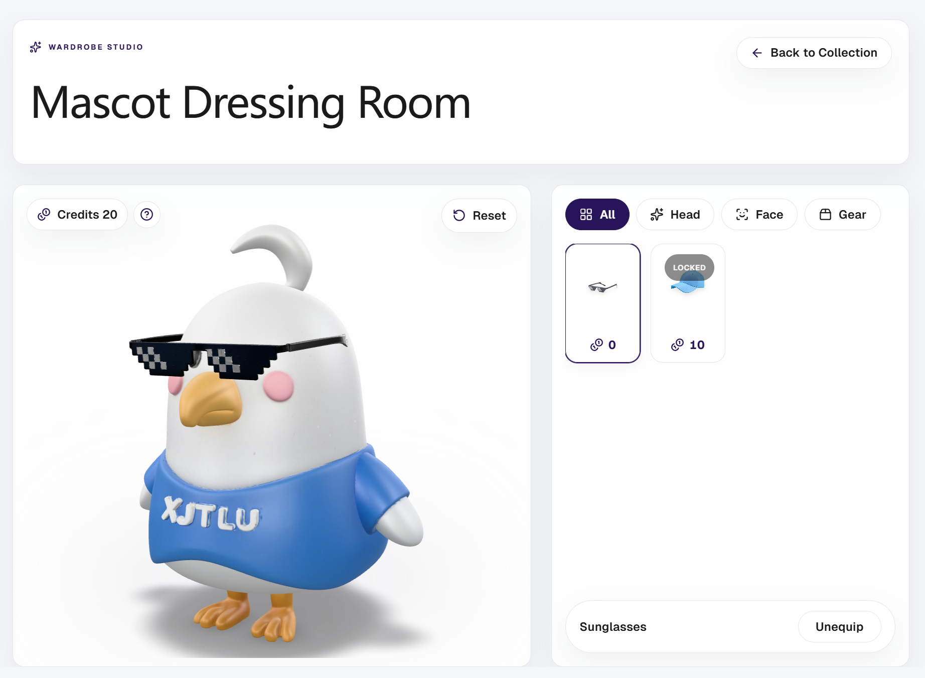
Option C (Our Decision): Cross-module Token Economy
Connecting the social Message Wall with the collection system: "Likes" received on the wall are converted into a virtual currency ("Campass Credit") used to purchase accessories in a 3D Avatar Studio.
Option A: Pure Achievement Leaderboards
The Dilemma: It creates a zero-sum environment. While it motivates a small percentage of highly competitive users, the majority of average users quickly experience burnout or abandon the app when they realize they cannot reach the top tier.